Discussions
of GDP growth at both national and international levels
often get carried away by relatively recent trends.
But it is sometime useful to situate recent income
growth in the longer term context, if only to remind
ourselves of the structural processes involved.
It is also useful because the second half of the twentieth
century is generally perceived as the most dynamic
in the history of capitalism. It is also seen as a
period in which at least some developing countries
managed to improve their relative position in the
global income hierarchy, in different phases and through
different trajectories.
There are various ways in which this is supposed to
have occurred. Import substituting industrialisation
in the 1950s and 1960s played a role in diversifying
large developing and thereby generating a higher rate
of GDP growth. Oil exporting countries benefited from
the oil price increases of the second half of the
1970s, which enabled some of them top move to a higher
level of per capita income. According to some analysts,
the most recent "globalisation" phase of
the 1990s has enabled some countries – China and India
in particular – to benefit from more open global trade
and thereby increase per capita incomes and reduce
poverty.
All this would presumably have operated to create
more convergence of incomes between the developed
and developing worlds, even if in fits and starts,
such that the gap between per capita incomes of countries
across the world would start reducing. While this
can and has been examined with econometric analyses
of varying degrees of sophistication, it is also possible
to just look at the overall evidence on GDP growth
patterns from different sources.
Table 1 provides evidence on shares of various regions
over the period 1950-1998, of global population and
global GDP re-estimated according to Purchasing Power
Parity (PPP). These are based on data provided in
an OECD study by Angus Maddison (Angus Maddison: The
World Economy: A Millenial Perspective, OECD Paris
2001).
PPP estimates are used instead of nominal exchange
rates to compare income across economies, because
of the widely observed reality that currencies command
different purchasing power in different countries,
than is suggested by the nominal rates. However, there
are some well-known problems in the estimates of income
using exchange rates based on PPP, not least of which
are the issues of choosing comparable baskets of goods
and the poor quality of the data on actual prices
prevailing in different countries (including large
developing countries such as China and India) that
are used in such studies, which affect the reliability
of such calculations.
There is a less talked about but equally significant
conceptual problem with using PPP estimates. In general,
countries that have high PPP, that is where the actual
purchasing power of the currency is deemed to be much
higher than the nominal value, are typically low-income
countries with low average wages. It is precisely
because there is a significant section of the workforce
that receives very low remuneration, that goods and
services are available cheaply. Therefore, using PPP-modified
GDP data may miss the point, by seeing as an advantage
the very feature that reflects greater poverty of
the majority of wage earners in that economy.
Nevertheless, PPP-based estimates have been widely
used, even though they are likely to overestimate
incomes of working people in lower-income countries
for the reasons described above. Maddison's estimates,
presented in Table 1, allow us to track the relative
population and income shares by broad category of
country for the latter half of the 20th century.
Table
1: Shares
of global population and income in PPP terms |
|
Percent share of world population |
Per cent share of world output
in PPP terms |
|
Developed
Countries |
|
1950 |
19 |
57 |
|
1973 |
15.6 |
50.9 |
|
1998 |
12.1 |
45.6 |
|
Developing Countries |
|
1950 |
70.4 |
30 |
|
1973 |
75.2 |
36.1 |
|
1998 |
81 |
49 |
|
Eastern
Europe and Former USSR |
|
1950 |
10.6 |
13.1 |
|
1973 |
9.2 |
12.8 |
|
1998 |
6.9 |
5.4 |
|
Source:
Angus Maddison (2001) |
Table
1 >> Click
to Enlarge
It is evident that, as far as
the countries that were known as "developed"
in 1950 are concerned, there has been relatively little
change in the per capita income position vis-a-vis
the rest of the world, especially since the mid-1970s.
In 1950 the developed countries received nearly 60
per cent of global income, but they also accounted
for almost 20 per cent of world population. In the
twenty five years after 1973, the share of the income
of the developed countries fell by only 10 per cent,
or 5.3 percentage points, whereas the share of population
declined by 22 per cent or 3.5 percentage points.
So even in PPP terms, just above one-tenth of global
population in the developed countries still receives
nearly half the world's income.
Consider the same ratios for the developing countries
taken as a group. This category includes all the “success
stories” of the developing world in East Asia and
elsewhere, the socialist countries outside of Eastern
Europe and the former USSR as well as several oil-exporting
countries that have benefited from global oil price
booms. There has been some improvement in global income
shares for this group as a whole, but this has been
far outpaced by the growing share of the developing
world in global population. So, between 1950 and 1998
developing countries managed to increase their share
of global income by 15 per cent, or nearly 11 percentage
points, their share of global population increased
by a whopping 63 per cent, or 19 percentage points,
so that there was no relative increase in per capita
terms.
The countries of the former Soviet Union and Eastern
Europe have typically been treated as outside of both
these categories, and it is interesting to note how
this process worked out for these countries. Between
1950 and 1973, the conditions appeared broadly stable,
that is, there was a slight decline in both population
and global GDP shares. However, after 1973 – or more
accurately, probably after 1989 and the collapse of
the Berlin Wall – there has been a sharp decline in
population share (35 per cent, or 4 percentage points),
associated with an even sharper decline in income
share (59 per cent, or 8 percentage points).
Given all the problems of basing inter-country income
comparisons on PPP estimates, it is worth looking
at comparisons based on nominal exchange rates, which
do provide some idea of inter-country income differentials
especially in a world in which trade penetration is
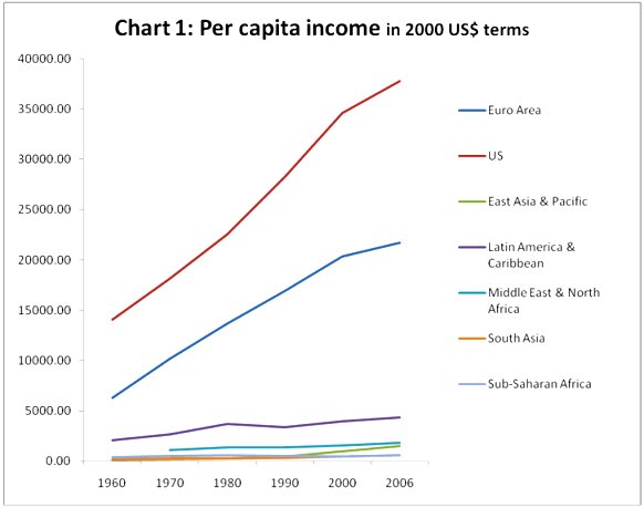
increasing. Chart 1 provides the evidence on per capita
incomes across some major countries and country groupings
for the period 1960-2006, based on the World Bank’s
World Development Indicators.
Chart
1 >> Click
to Enlarge
This chart shows very clearly how large the global
income gaps are. The initial differences in per capita
incomes (in 1960 in this case) were so large that
even quite rapid increases in per capita incomes in
some regions over the subsequent four and half decades
have not managed to make the gap more repsectable.
Thus, while the per capita income of the fastest growing
developing region – East Asia – increased by more
than ten times over this period compared to an increase
of less than three times for the US, in 2006, the
average income for US was still fifteen times that
of East Asia.
For other developing regions the per capita income
gaps have been even larger and in some cases growing.
Thus, the per capita GDP in the current Euro area
in 1960 was 34 times that of South Asia; but by 2006,
it had increased to 36 times. For Sub-Saharan Africa,
the widening gap was even more stark. In 1960, the
per capita income of the countries that are now in
the Euro Area was 15 times that of Sub-Saharan Africa;
by 2006, the difference was as large as 38 times.
Latin America was then and remains the richest developing
region, yet the per capita income gaps between it
and both the US and the EU have increased in the past
forty six years. Even for countries in the Middle
East and North Africa, which contains several major
oil exporters, the income gaps have grown substantially
with respect to both the US and the Euro Area countries.
Another way of examining this is to look at the share
of countries or regions in world GDP in dollar terms,
rather than in PPP terms. It turns out that at nominal
exchange rates, the share of developing countries,
even the largest and most dynamic ones, remains quite
puny. Even in the first six years of this century,
after more than two decades of rapid growth in China
and India, the two countries account for less than
7 per cent of global GDP compared to 30 per cent for
the US (changed relatively little from the 1960s)
and 14 per cent for Japan. The share of China, India,
Brazil and Argentina together in 2000-06 was less
than 10 per cent.
This pattern is at least partly because the growth
performance of the developing world has been so uneven.
Within the developing world, only East Asia and the
Pacific and South Asia show any significant acceleration
of growth since the 1960s or indeed higher growth
rates than the developing world. Furthermore, it is
evident that for South Asia the acceleration is relatively
recent, so it is really only East Asia and the Pacific
that in the aggregate has shown rapid growth over
a prolonged period.
The other developing regions showed higher growth
rates during the import substitution phase, and do
not appear to have benefited much from the "globalisation"
phase in GDP growth terms. If the 1980s was a "lost
decade" for Latin America, with declines in real
GDP, the subsequent decade was not much better, especially
given the low base. Even the recent spurt has led
to average growth rates of less than 2 per cent per
annum. Meanwhile Sub-Saharan Africa has experienced
two lost decades, with average real GDP (in aggregate,
not per capita terms) falling continuously in the
1980s and the 1990s.
So the picture of a very dynamic and rapidly changing
world economy, in which developing countries are emerging
as the major players, may be overplayed. A longer
term perspective on growth suggests that for much
of the developing world, relative positions in the
international economy have hardly changed at all.
